Easton's Blog Easton's Blog
首页
  • 编程语言

    • Python
  • 框架

    • Django
  • Mdn (opens new window)
  • HTML
  • CSS
  • JavaScript
  • Mysql
  • PostgreSQL
  • Elasticsearch
  • MongoDB
  • Redis
  • 服务器命令
  • Docker
  • GIT
  • 摄影
  • 草稿
  • 归类方式

    • 分类
    • 标签
    • 归档
  • 关于博客

    • 博客教程
    • 友情链接
    • 关于
导航站
GitHub (opens new window)

Easton Yang

爱生活😊爱学习
首页
  • 编程语言

    • Python
  • 框架

    • Django
  • Mdn (opens new window)
  • HTML
  • CSS
  • JavaScript
  • Mysql
  • PostgreSQL
  • Elasticsearch
  • MongoDB
  • Redis
  • 服务器命令
  • Docker
  • GIT
  • 摄影
  • 草稿
  • 归类方式

    • 分类
    • 标签
    • 归档
  • 关于博客

    • 博客教程
    • 友情链接
    • 关于
导航站
GitHub (opens new window)
  • HTML

  • CSS

    • 排版

      • flex弹性盒子
        • flex 模型说明
        • 容器属性
          • 组合样式动态演示
          • flex-wrap 动态演示
          • flex-direction 动态演示
          • flex-flow
          • justify-content 动态演示
          • align-items 动态演示
          • align-content 动态演示
        • 容器中 item 块的属性
          • order 排序演示
          • flex-grow 动态演示
          • flex-shrink 动态演示
          • flex-basis 动态演示
          • flex 动态演示
          • align-self 动态演示
      • grid 网格布局
    • 属性

    • 样式案例

    • 练习
  • JavaScript

  • 前端
  • CSS
  • 排版
eastonyangxu
2023-05-25
目录

flex弹性盒子

flex 弹性布局文档 (opens new window)

# flex 模型说明

flex_terms.png

提示

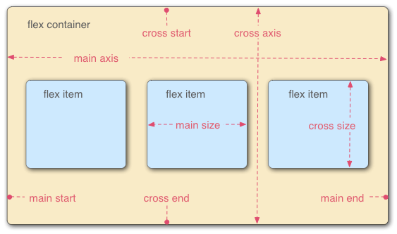
当元素表现为 flex 框时,它们沿着两个轴来布局:

  • 主轴(main axis)是沿着 flex 元素放置的方向延伸的轴(比如页面上的横向的行、纵向的列)。该轴的开始和结束被称为 main start 和 main end。
  • 交叉轴(cross axis)是垂直于 flex 元素放置方向的轴。该轴的开始和结束被称为 cross start 和 cross end。
  • 设置了 display: flex 的父元素(在本例中是 演示)被称之为 flex 容器(flex container)。
  • 在 flex 容器中表现为弹性的盒子的元素被称之为 flex 项(flex item)本例中是 演示 元素。

# 容器属性

# 组合样式动态演示

flex-1
flex-2
flex-3
flex-4
flex-5
文档
文档
文档
文档
文档

# flex-wrap 动态演示

提示

flex-wrap 属性指定 flex 元素单行显示还是多行显示。如果允许换行,这个属性允许你控制行的堆叠方向。

flex-1
flex-2
flex-3
flex-4
  • nowrap
  • wrap
  • wrap-reverse

无数据

文档

# flex-direction 动态演示

提示

flex-direction 属性指定了内部元素是如何在 flex 容器中布局的,定义了主轴的方向 (正方向或反方向)。

注意

值 row 和 row-reverse 受 flex 容器的方向性的影响。如果它的 dir 属性是 ltr,row 表示从左到右定向的水平轴,而 row-reverse 表示从右到左; 如果 dir 属性是 rtl,row 表示从右到左定向的轴,而 row-reverse 表示从左到右。

flex-1
flex-2
flex-3
  • row
  • row-reverse
  • column
  • column-reverse

无数据

文档

# flex-flow

提示

flex-flow 属性是 flex-direction 属性和 flex-wrap 属性的简写形式,默认值为 row nowrap。

.box {
  flex-flow: <flex-direction> || <flex-wrap>;
}
1
2
3

# justify-content 动态演示

提示

justify-content 属性定义了浏览器之间,如何分配顺着 弹性容器主轴 (或者网格行轴) 的元素之间及其周围的空间。 参数具体含义请参考文档 (opens new window)

flex-1
flex-2
flex-3
  • start
  • end
  • flex-start
  • flex-end
  • left
  • right
  • center
  • space-between
  • space-around
  • space-evenly
  • stretch

无数据

文档

# align-items 动态演示

提示

align-items 属性将所有直接子节点上的 align-self 值设置为一个组。align-self 属性设置项目在其包含块中在弹性容器交叉轴上的对齐方式。参数具体含义请参考文档 (opens new window)

item-1
item-2
item-3
  • normal
  • start
  • end
  • flex-start
  • flex-end
  • self-start
  • self-end
  • center
  • stretch
  • baseline
  • first baseline
  • last baseline
  • safe flex-start
  • safe flex-end
  • unsafe flex-start
  • unsafe flex-end

无数据

文档

# align-content 动态演示

提示

align-content 属性设置了浏览器如何沿着弹性盒子(flex)布局的纵轴和网格布局(grid)的主轴在内容项之间和周围分配空间。参数具体含义请参考文档 (opens new window)

item-1
item-2
item-3
item-4
item-5
  • normal
  • start
  • end
  • flex-start
  • flex-end
  • center
  • space-between
  • space-around
  • space-evenly
  • stretch
  • baseline
  • first baseline
  • last baseline
  • safe flex-start
  • safe flex-end
  • unsafe flex-start
  • unsafe flex-end

无数据

文档

# 容器中 item 块的属性

# order 排序演示

提示

order 属性规定了弹性容器中的可伸缩项目在布局时的顺序。元素按照 order 属性的值的增序进行布局,默认值都为 0。拥有相同 order 属性值的元素按照它们在源代码中出现的顺序进行布局。。参数具体含义请参考文档 (opens new window)

item-1order:0
item-2order:0
item-3order:0
item-4order:0
item-5order:0
选择 order 进行排序:
  • -2
  • -1
  • 0
  • 1
  • 2
  • 3
  • 4
  • 5
  • 6
  • 7

无数据

  • -2
  • -1
  • 0
  • 1
  • 2
  • 3
  • 4
  • 5
  • 6
  • 7

无数据

  • -2
  • -1
  • 0
  • 1
  • 2
  • 3
  • 4
  • 5
  • 6
  • 7

无数据

  • -2
  • -1
  • 0
  • 1
  • 2
  • 3
  • 4
  • 5
  • 6
  • 7

无数据

  • -2
  • -1
  • 0
  • 1
  • 2
  • 3
  • 4
  • 5
  • 6
  • 7

无数据

文档

# flex-grow 动态演示

提示

flex-grow 设置 flex 项 主尺寸 的 flex 增长系数。负值无效,默认为 0。

剩余空间是 flex 容器的大小减去所有 flex 项的大小加起来的大小。如果所有的兄弟项目都有相同的 flex-grow 系数,那么所有的项目将剩余空间按相同比例分配,否则将根据不同的 flex-grow 定义的比例进行分配。

item-1flex-grow:0
item-2flex-grow:0
item-3flex-grow:0
item-4flex-grow:0
item-5flex-grow:0
选择 flex-grow 进行尺寸调整:
  • 0
  • 1
  • 2
  • 3
  • 4
  • 5
  • 6
  • 7

无数据

  • 0
  • 1
  • 2
  • 3
  • 4
  • 5
  • 6
  • 7

无数据

  • 0
  • 1
  • 2
  • 3
  • 4
  • 5
  • 6
  • 7

无数据

  • 0
  • 1
  • 2
  • 3
  • 4
  • 5
  • 6
  • 7

无数据

  • 0
  • 1
  • 2
  • 3
  • 4
  • 5
  • 6
  • 7

无数据

文档

# flex-shrink 动态演示

提示

控制缩放,要超过容器以后才会有效果,不然不需要缩放。

flex-shrink 属性指定了 flex 元素的收缩规则。flex 元素仅在默认宽度之和大于容器的时候才会发生收缩,其收缩的大小是依据 flex-shrink 的值。负值无效,默认为 1。

item-1flex-shrink:1
item-2flex-shrink:1
item-3flex-shrink:1
item-4flex-shrink:1
item-5flex-shrink:1
选择 flex-shrink 进行尺寸调整:
  • 0
  • 1
  • 2
  • 3
  • 4
  • 5
  • 6
  • 7

无数据

  • 0
  • 1
  • 2
  • 3
  • 4
  • 5
  • 6
  • 7

无数据

  • 0
  • 1
  • 2
  • 3
  • 4
  • 5
  • 6
  • 7

无数据

  • 0
  • 1
  • 2
  • 3
  • 4
  • 5
  • 6
  • 7

无数据

  • 0
  • 1
  • 2
  • 3
  • 4
  • 5
  • 6
  • 7

无数据

文档

# flex-basis 动态演示

提示

控制宽度,通过数值或者百分比两种方式。

flex-basis 指定了 flex 元素在主轴方向上的初始大小。如果不使用 box-sizing 改变盒模型的话,那么这个属性就决定了 flex 元素的内容盒(content-box)的尺寸。该值也可以是一个相对于其父弹性盒容器主轴尺寸的百分数 。负值是不被允许的。默认为 auto。

当一个元素同时被设置了 flex-basis (除值为 auto 外) 和 width (或者在 flex-direction: column 情况下设置了 height) , flex-basis 具有更高的优先级。

在下面的演示中,只有item-1: auto时,width-1 才会生效。

item-1flex-basis:auto
item-2flex-basis:auto
item-3flex-basis:auto
item-4flex-basis:auto
选择 flex-basis 进行尺寸调整:
  • auto
  • 10rem
  • 20rem
  • 200px
  • 40rem
  • 25%

无数据

  • 10rem
  • 15rem
  • 20rem
  • 200px
  • 40rem
  • 400px

无数据

  • auto
  • 10rem
  • 20rem
  • 200px
  • 40rem
  • 25%

无数据

  • auto
  • 10rem
  • 20rem
  • 200px
  • 40rem
  • 25%

无数据

  • auto
  • 10rem
  • 20rem
  • 200px
  • 40rem
  • 25%

无数据

文档

# flex 动态演示

提示

flex 是 flex-grow、flex-shrink、flex-basis 的简写。默认值:0 1 auto

可以使用一个,两个或三个值来指定 flex 属性。

单值语法: 值必须为以下其中之一:

  • 一个无单位数(number): 它会被当作 flex:number 1 0; <flex-shrink>的值被假定为 1,然后<flex-basis> 的值被假定为 0。
  • 一个有效的 宽度 (width) 值:它会被当作 <flex-basis> 的值。

双值语法: 第一个值必须为一个无单位数,并且它会被当作 <flex-grow> 的值。第二个值必须为以下之一:

  • 一个无单位数:它会被当作 <flex-shrink> 的值。
  • 一个有效的宽度值:它会被当作 <flex-basis> 的值。

三值语法:

  • 第一个值必须为一个无单位数,并且它会被当作 <flex-grow> 的值。
  • 第二个值必须为一个无单位数,并且它会被当作 <flex-shrink> 的值。
  • 第三个值必须为一个有效的宽度值,并且它会被当作 <flex-basis> 的值。

取值:

initial:相当于 flex: 0 1 auto,元素会根据自身宽高设置尺寸。它会缩短自身以适应 flex 容器,但不会伸长并吸收 flex 容器中的额外自由空间来适应 flex 容器。

auto:相当于 flex: 1 1 auto,元素会根据自身的宽度与高度来确定尺寸,但是会伸长并吸收 flex 容器中额外的自由空间,也会缩短自身来适应 flex 容器。

none:相当于 flex: 0 0 auto,元素会根据自身宽高来设置尺寸。它是完全非弹性的:既不会缩短,也不会伸长来适应 flex 容器。

item-1flex:initial
item-2flex:initial
item-3flex:initial
选择 flex 进行演示:
  • auto
  • initial
  • none
  • 1
  • 10rem
  • 1 1
  • 2 1
  • 1 10rem
  • 1 1 10rem
  • 0 1 20%

无数据

  • auto
  • initial
  • none
  • 1
  • 10rem
  • 1 1
  • 2 1
  • 1 10rem
  • 1 1 10rem
  • 0 1 20%

无数据

  • auto
  • initial
  • none
  • 1
  • 10rem
  • 1 1
  • 2 1
  • 1 10rem
  • 1 1 10rem
  • 0 1 20%

无数据

文档

# align-self 动态演示

提示

align-self 会对齐当前 grid 或 flex 行中的元素,并覆盖已有的 align-items 的值。

align-self 属性不适用于块类型的盒模型和表格单元。如果任何 flexbox 元素的侧轴方向 margin 值设置为 auto,则会忽略 align-self。

item-1align-self:auto
item-2align-self:auto
item-3align-self:auto
item-4align-self:auto
item-5align-self:auto
选择 align-self 进行尺寸调整:
  • auto
  • normal
  • stretch
  • flex-start
  • flex-end
  • self-start
  • self-end
  • center
  • baseline
  • first baseline
  • last baseline
  • safe flex-start
  • safe flex-end
  • unsafe flex-start
  • unsafe flex-end

无数据

  • auto
  • normal
  • stretch
  • flex-start
  • flex-end
  • self-start
  • self-end
  • center
  • baseline
  • first baseline
  • last baseline
  • safe flex-start
  • safe flex-end
  • unsafe flex-start
  • unsafe flex-end

无数据

  • auto
  • normal
  • stretch
  • flex-start
  • flex-end
  • self-start
  • self-end
  • center
  • baseline
  • first baseline
  • last baseline
  • safe flex-start
  • safe flex-end
  • unsafe flex-start
  • unsafe flex-end

无数据

  • auto
  • normal
  • stretch
  • flex-start
  • flex-end
  • self-start
  • self-end
  • center
  • baseline
  • first baseline
  • last baseline
  • safe flex-start
  • safe flex-end
  • unsafe flex-start
  • unsafe flex-end

无数据

  • auto
  • normal
  • stretch
  • flex-start
  • flex-end
  • self-start
  • self-end
  • center
  • baseline
  • first baseline
  • last baseline
  • safe flex-start
  • safe flex-end
  • unsafe flex-start
  • unsafe flex-end

无数据

文档
#CSS
上次更新: 2023/08/08, 20:00:46
html标签
grid 网格布局

← html标签 grid 网格布局→

最近更新
01
攻略制作要点
07-18
02
摄影主题拍摄
07-18
03
延时摄影剧本
07-18
更多文章>
Theme by Vdoing | Copyright © 2023-2024 Easton Yang | MIT License
  • 跟随系统
  • 浅色模式
  • 深色模式
  • 阅读模式